Partial Dependence Plots
The topic of model interpretability has gained a lot of attention recently with the rapid development of highly complex machine learning algorithms for dealing with ‘big data’. While these complex algorithms outperform classical linear algorithms, like linear regression and logistic regression, with respect to predictive power and ability to take non-linear relationships between explanatory and target variables into consideration, this comes at the expense of reduced model transparency and interpretability. This further creates obstacles for the adoption of these algorithms in certain domains that are subject to regulatory scrutiny and approval. A good example is credit risk models that are used for regulatory capital estimation. See, for instance, EBA Discussion Paper on Machine Learning for IRB Models.
Given the size and importance of the problem, some distinct approaches have been devised for relating model inputs to model outputs and explaining model predictions:
- measuring feature importances to make sure they make sense;
- explaining model output by investigating contributions of each of the input variables as in Shapley values;
- explaining model outputs by fitting locally interpretable surrogate models, like Local Interpretable Model-agnostic Explanations (LIME).
However, graphical tools remain some of the most revealing and easy-to-understand ways for investigating complex machine learning algorithms. Partial dependence plot (PDP), which is the subject of this blog post, is one such tool. The idea behind PDP is to graphically investigate the relationship between model output and a set of target features, usually one or two, while marginalizing over the remaining features. Mathematically,
\[\begin{align} PD_{X_T}(x_T) &:= E_{X_T^C}\left[f\left(x_T, X_T^C\right)\right] \notag \\ &= \int f\left(x_T, x_T^C\right)p(x_T^C)dx_T^C \label{eq:partial_dependence}, \end{align}\]where
- $X_T$: set of target features;
- $x_t$: point, i.e., particular values of target features, at which partial dependence is estimated;
- $X_T^C$: set of remaining features;
- $PD_{X_T}(x_T)$: partial dependence at point $x_t$;
- $f$: estimator (model).
The value of the integral in ($\ref{eq:partial_dependence}$) can be approximated from a sample as follows:
\[\begin{equation} \label{eq:partial_dependence_implementation} PD_{X_T}(x_T) \approx \frac{1}{N} \sum_{i=1}^{N} f\left(x_T, x_{T, i}^C\right), \end{equation}\]where $N$ is the number of observations in the sample.
The underlying assumption of the PDP methodology is that the target features are not correlated with each other and not correlated with the remaining features. If this assumption does not hold, which is often the case in practice, there may be invalid points used when estimating partial dependence values.
In the following section we will provide Python implementation of equation ($\ref{eq:partial_dependence_implementation}$) and create plotting functions.
Python Implementation
Below we load required Python libraries.
import pandas as pd
import numpy as np
from sklearn.base import BaseEstimator
from sklearn.ensemble import RandomForestClassifier
from sklearn.utils.validation import check_is_fitted
from sklearn.exceptions import NotFittedError
from sklearn.base import is_classifier
import matplotlib.pyplot as plt
import seaborn as sns
from typing import Tuple, List, Union, Optional
import warnings
warnings.filterwarnings("ignore")
We start off by defining partial_dependence_1d function that implements equation ($\ref{eq:partial_dependence_implementation}$) when there is a single target feature.
def partial_dependence_1d(estimator: BaseEstimator,
                          X: pd.DataFrame,
                          feature: Union[List[str], str]) -> pd.Series:
    """
    Partial dependence for `feature`.

    :param estimator: estimator that has been fit to data
    :param X: dataframe of features with shape (N_samples, N_features)
    :param feature: feature for which partial dependence is estimated
    :return: estimated partial dependence
    """
    _check_estimator(estimator)
    if isinstance(feature, list):
        feature = feature[0]
    assert feature in X.columns, f"`{feature}` column could not be found in the dataframe."

    X = X.copy()
    unique_vals = np.sort(X[feature].unique())
    res = pd.Series(np.zeros_like(unique_vals), index=unique_vals, name=feature)
    for i, val in enumerate(unique_vals):
        X[feature] = val
        if is_classifier(estimator):
            preds = estimator.predict_proba(X.values)[:, 1]
        else:
            preds = estimator.predict(X.values)
        res.iloc[i] = np.mean(preds, axis=0)
    return res


def _check_estimator(estimator: BaseEstimator) -> None:
    """
    Check if estimator has been fit to data and has required methods.

    :param estimator: estimator to check
    """
    assert isinstance(estimator, BaseEstimator), "Estimator is not an instance of `BaseEstimator`."

    if is_classifier(estimator):
        assert "predict_proba" in dir(estimator), "There is no `predict_proba` method."
    else:
        assert "predict" in dir(estimator), "There is no `predict` method."

    try:
        check_is_fitted(estimator)
    except NotFittedError:
        print("The estimator has not been fit to data. Please, fit the estimator to data first.")
We continue by defining partial_dependence_2d function that implements equation ($\ref{eq:partial_dependence_implementation}$) for two target features.
def partial_dependence_2d(estimator: BaseEstimator,
                          X: pd.DataFrame,
                          features: List[str]) -> pd.DataFrame:
    """
    Partial dependence for `features`.

    :param estimator: estimator that has been fit to data
    :param X: dataframe of features with shape (N_samples, N_features)
    :param feature: features for which partial dependence is estimated. Must be a list of length 2
    :return: estimated partial dependence
    """
    if len(features) != 2:
        raise ValueError(f"`features` should be a list of length two.")
    for feature in features:
        if not feature in X.columns:
            raise RuntimeError(f"{feature} not in dataframe.")

    X = X.copy()
    unique_vals = np.sort(X[features[0]].unique())
    res = pd.DataFrame(columns=unique_vals)
    for i, val in enumerate(unique_vals):
        X[features[0]] = val
        partial_dependence = partial_dependence_1d(estimator, X, features[1])
        res.loc[:, val] = partial_dependence
    res.index = partial_dependence.index
    return res
Finally, we create the plotting function below.
def partial_dependence_plot(estimator: BaseEstimator,
                            X: pd.DataFrame,
                            features: Union[str, List[str]],
                            figsize: Tuple=(10, 5)) -> plt.Figure:
    """
    Return partial dependence plot:
    - plot of partial dependence if `features` is a string or a list of length 1
    - contour plot of partial dependence if `features` is a list of length 2

    :param estimator: estimator that has been fit to data
    :param X: dataframe of features with shape (N_samples, N_features)
    :param feature: target feature(s)
    :param figsize: size of plot
    :return: partial dependence plot
    """
    if isinstance(features, str) or len(features)==1:
        return partial_dependence_plot_1d(estimator, X, features, figsize)
    return partial_dependence_plot_2d(estimator, X, features, figsize)


def partial_dependence_plot_1d(estimator: BaseEstimator,
                               X: pd.DataFrame,
                               feature: Union[str, List[str]],
                               figsize: Tuple=(10, 5)) -> plt.Figure:
    """
    Return partial dependence plot for a single target feature.

    :param estimator: estimator that has been fit to data
    :param X: dataframe of features with shape (N_samples, N_features)
    :param feature: target feature
    :param figsize: size of plot
    :return: partial dependence plot
    """
    if isinstance(feature, list):
        feature = feature[0]
    pd = partial_dependence_1d(estimator, X, feature)
    fig = plt.figure(figsize=figsize)
    plt.plot(pd)
    plt.ylabel("Partial Dependence")
    plt.xlabel(f"{pd.name}")
    if len(pd) < 10:
        plt.xticks(pd.index)
    plt.grid()
    plt.close()
    return fig


def partial_dependence_plot_2d(estimator: BaseEstimator,
                               X: pd.DataFrame,
                               features: List[str],
                               figsize: Tuple=(10, 5)) -> plt.Figure:
    """
    Return partial dependence plot for two target features.

    :param estimator: estimator that has been fit to data
    :param X: dataframe of features with shape (N_samples, N_features)
    :param feature: list of two features
    :param figsize: size of plot
    :return: partial dependence plot
    """
    pd = partial_dependence_2d(estimator, X, features)
    fig = plt.figure(figsize=figsize)
    plt.contourf(pd.columns, pd.index, pd)
    plt.colorbar()
    plt.xlabel(f"{features[0]}")
    plt.ylabel(f"{features[1]}")
    plt.close()
    return fig
To demonstrate what partial dependence plots actually look like, we will work with the heart failure clinical records dataset that can be downloaded here. We will fit a random forest classifier to this dataset and then investigate the relationship between some of the explanatory variables and the predicted probabilities of positive class from the model using PDPs.
Let us start by loading the dataset into pandas dataframe.
df = pd.read_csv("data/heart_failure_clinical_records_dataset.csv")
print(f"Dataset shape: {df.shape}")
df.head()
Dataset shape: (299, 13)
| age | anaemia | creatinine_phosphokinase | diabetes | ejection_fraction | high_blood_pressure | platelets | serum_creatinine | serum_sodium | sex | smoking | time | DEATH_EVENT | |
|---|---|---|---|---|---|---|---|---|---|---|---|---|---|
| 0 | 75.0 | 0 | 582 | 0 | 20 | 1 | 265000.00 | 1.9 | 130 | 1 | 0 | 4 | 1 |
| 1 | 55.0 | 0 | 7861 | 0 | 38 | 0 | 263358.03 | 1.1 | 136 | 1 | 0 | 6 | 1 |
| 2 | 65.0 | 0 | 146 | 0 | 20 | 0 | 162000.00 | 1.3 | 129 | 1 | 1 | 7 | 1 |
| 3 | 50.0 | 1 | 111 | 0 | 20 | 0 | 210000.00 | 1.9 | 137 | 1 | 0 | 7 | 1 |
| 4 | 65.0 | 1 | 160 | 1 | 20 | 0 | 327000.00 | 2.7 | 116 | 0 | 0 | 8 | 1 |
The dataset contains information about 299 patients who had heart failure. There are 13 clinical features that were collected in the period following the medical event:
- age: age of the patient (years);
- anaemia: decrease of red blood cells or hemoglobin (boolean);
- high blood pressure: if the patient has hypertension (boolean);
- creatinine phosphokinase (CPK): level of the CPK enzyme in the blood (mcg/L);
- diabetes: if the patient has diabetes (boolean);
- ejection fraction: percentage of blood leaving the heart at each contraction (percentage);
- platelets: platelets in the blood (kiloplatelets/mL);
- sex: woman or man (binary);
- serum creatinine: level of serum creatinine in the blood (mg/dL);
- serum sodium: level of serum sodium in the blood (mEq/L);
- smoking: if the patient smokes or not (boolean);
- time: follow-up period (days);
- [target] death event: if the patient deceased during the follow-up period (boolean).
Let us perform a quick look into the description of the dataset.
def describe_df(df: pd.DataFrame) -> pd.DataFrame:
    """
    Describe pandas dataframe.

    :param df: input dataframe
    :return: description of the dataset
    """
    col_types = df.dtypes
    col_types.name = "dtype"

    n_missing = df.isna().astype(int).sum(axis=0)
    n_missing.name = "n_missing"

    pct_missing = n_missing / len(df)
    pct_missing.name = "pct_missing"

    n_unique = df.nunique()
    n_unique.name = "n_unique"

    skewness = df.skew()
    skewness.name = "skewness"

    kurtosis = df.kurt()
    kurtosis.name = "kurtosis"

    return pd.concat([col_types, n_missing, pct_missing, n_unique, df.describe().T, skewness, kurtosis],
                     axis=1)

describe_df(df)
| dtype | n_missing | pct_missing | n_unique | count | mean | std | min | 25% | 50% | 75% | max | skewness | kurtosis | |
|---|---|---|---|---|---|---|---|---|---|---|---|---|---|---|
| age | float64 | 0 | 0.0 | 47 | 299.0 | 60.833893 | 11.894809 | 40.0 | 51.0 | 60.0 | 70.0 | 95.0 | 0.423062 | -0.184871 |
| anaemia | int64 | 0 | 0.0 | 2 | 299.0 | 0.431438 | 0.496107 | 0.0 | 0.0 | 0.0 | 1.0 | 1.0 | 0.278261 | -1.935563 |
| creatinine_phosphokinase | int64 | 0 | 0.0 | 208 | 299.0 | 581.839465 | 970.287881 | 23.0 | 116.5 | 250.0 | 582.0 | 7861.0 | 4.463110 | 25.149046 |
| diabetes | int64 | 0 | 0.0 | 2 | 299.0 | 0.418060 | 0.494067 | 0.0 | 0.0 | 0.0 | 1.0 | 1.0 | 0.333929 | -1.901254 |
| ejection_fraction | int64 | 0 | 0.0 | 17 | 299.0 | 38.083612 | 11.834841 | 14.0 | 30.0 | 38.0 | 45.0 | 80.0 | 0.555383 | 0.041409 |
| high_blood_pressure | int64 | 0 | 0.0 | 2 | 299.0 | 0.351171 | 0.478136 | 0.0 | 0.0 | 0.0 | 1.0 | 1.0 | 0.626732 | -1.618076 |
| platelets | float64 | 0 | 0.0 | 176 | 299.0 | 263358.029264 | 97804.236869 | 25100.0 | 212500.0 | 262000.0 | 303500.0 | 850000.0 | 1.462321 | 6.209255 |
| serum_creatinine | float64 | 0 | 0.0 | 40 | 299.0 | 1.393880 | 1.034510 | 0.5 | 0.9 | 1.1 | 1.4 | 9.4 | 4.455996 | 25.828239 |
| serum_sodium | int64 | 0 | 0.0 | 27 | 299.0 | 136.625418 | 4.412477 | 113.0 | 134.0 | 137.0 | 140.0 | 148.0 | -1.048136 | 4.119712 |
| sex | int64 | 0 | 0.0 | 2 | 299.0 | 0.648829 | 0.478136 | 0.0 | 0.0 | 1.0 | 1.0 | 1.0 | -0.626732 | -1.618076 |
| smoking | int64 | 0 | 0.0 | 2 | 299.0 | 0.321070 | 0.467670 | 0.0 | 0.0 | 0.0 | 1.0 | 1.0 | 0.770349 | -1.416080 |
| time | int64 | 0 | 0.0 | 148 | 299.0 | 130.260870 | 77.614208 | 4.0 | 73.0 | 115.0 | 203.0 | 285.0 | 0.127803 | -1.212048 |
| DEATH_EVENT | int64 | 0 | 0.0 | 2 | 299.0 | 0.321070 | 0.467670 | 0.0 | 0.0 | 0.0 | 1.0 | 1.0 | 0.770349 | -1.416080 |
We can make the following observations:
- we are only dealing with numerical data;
- there are no missing observations;
- there is a mix of continuous and binary variables;
- the dataset is not balanced with the percentage of positive class observations equal to 32.1%;
- “time” is not a feature and can be dropped from further consideration.
features = [col for col in df.columns if col not in ["time", "DEATH_EVENT"]]
target = "DEATH_EVENT"
As mentioned previously, the key assumption of the PDP methodology is that there is no correlation among target features, and between target features and remaining features. Therefore, below we plot the heatmap of Pearson’s correlations between all pairs of features.
sns.heatmap(df[features].corr(), cmap="crest")
plt.xticks(rotation=80);
Figure 1. Correlation Heatmap
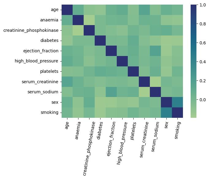
The only two variables with high pairwise correlation are “sex” and “smoking”. Therefore, if we end up using any of these two features as our target features, we need to be careful when interpreting the resulting PDP.
As random forest algorithm does not require any special data preprocessing, we can proceed by fitting the algorithm to our dataset. For the purposes of this exposition, we will fit the classifier to the whole dataset, i.e., we will not be leaving any data for validation or out-of-sample testing. While this will most certainly lead to overfitting, given the size of the dataset, the rationale is that we are only interested in investigating the learned relationships between explanatory variables and the output from the model. We do not plan to use the model for any other purposes.
estimator = RandomForestClassifier()
X = df[features].values
y = df[target].values
estimator.fit(X, y)
Having fitted the random forest algorithm to data, we can investigate PDPs for some of the features. According to “Machine learning can predict survival of patients with heart failure from serum creatinine and ejection fraction alone” by Chicco and Jurman (2020), that worked with the exact same dataset, the two most predictive features are “ejection_fraction” and “serum_creatinine”. Therefore, we will only investigate partial dependence plots for these two features. Below we plot the PDP for “ejection_fraction” variable.
partial_dependence_plot(estimator, df[features], "ejection_fraction")
Figure 2. Partial Dependence Plot. Ejection Fraction
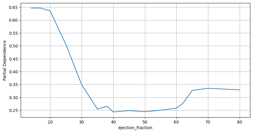
From the partial dependence plot it becomes clear that the ejection fraction levels in the range from 35 to 60 appear to be associated with the highest probabilities of survival. According to “Ejection Fraction: What the Numbers Mean” by Penn Medicine (2022),
- ejection fraction in the range from 55 to 70%: normal heart function;
- ejection fraction in the range from 40 to 55%: below normal heart function. Can indicate previous heart damage from heart attack or cardiomyopathy;
- ejection fraction higher than 75%: can indicate a heart condition like hypertrophic cardiomyopathy, a common cause of sudden cardiac arrest;
- ejection fraction less than 40%: may confirm the diagnosis of heart failure.
Therefore, the relationship learned by the model between “ejection_fraction” feature and the probability that a patient dies post heart failure appears valid and is confirmed by an independent source.
We proceed by plotting partial dependence plot for “serum_creatinine”.
partial_dependence_plot(estimator, df[features], "serum_creatinine")
Figure 3. Partial Dependence Plot. Serum Creatinine
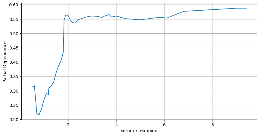
It is clear from the above plot that higher measurements of serum creatinine are associated with lower probabilities of survival. Serum creatinine levels below 1.5 are the “safest”. According to the article by Mayo Clinic on serum creatinine, the typical ranges are:
- adult men: 0.74 to 1.35 mg/dL;
- adult women: 0.59 to 1.04 mg/dL.
Thus, the relationship between serum creatinine and probability of death is correctly captured by the random forest algorithm.
Finally, we plot partial dependence plot for a pair of “ejection_fraction” and “serum_creatinine” variables.
partial_dependence_plot(estimator, df[features], ["serum_creatinine", "ejection_fraction"])
Figure 4. Partial Dependence Plot. Serum Creatinine and Ejection Fraction

The resulting contour plot comes with no surprises. As such, patients with the highest probability of survival have ejection fractions in the range from 35% to 60% with serum creatinine readings below 1 mg/dL. On the other hand, for serum creatinine levels above 2 mg/dL, patients with either very low or very high ejection fractions are associated with the highest probabilities of dying.
References
- Chicco, D., Jurman, G. Machine learning can predict survival of patients with heart failure from serum creatinine and ejection fraction alone. BMC Med Inform Decis Mak 20, 16 (2020). https://doi.org/10.1186/s12911-020-1023-5